Navigation design / Design direction
Next-generation
Lytx UI
I directed a team through a platform-wide UI redesign, defining the guiding principles and making hands-on design edits, with a particular focus on navigation: how users move between product areas, find tasks, and retain context.
That navigation work established the interface foundation for the broader exploration of dashboards, reports, fleet maps, and event review.
- My role
- Navigation design & team direction
- Scope
- Web platform & mobile patterns
- Artifact
- Next Gen UI design deck · September 2024
01 / Navigation focus
Navigation as the foundation.
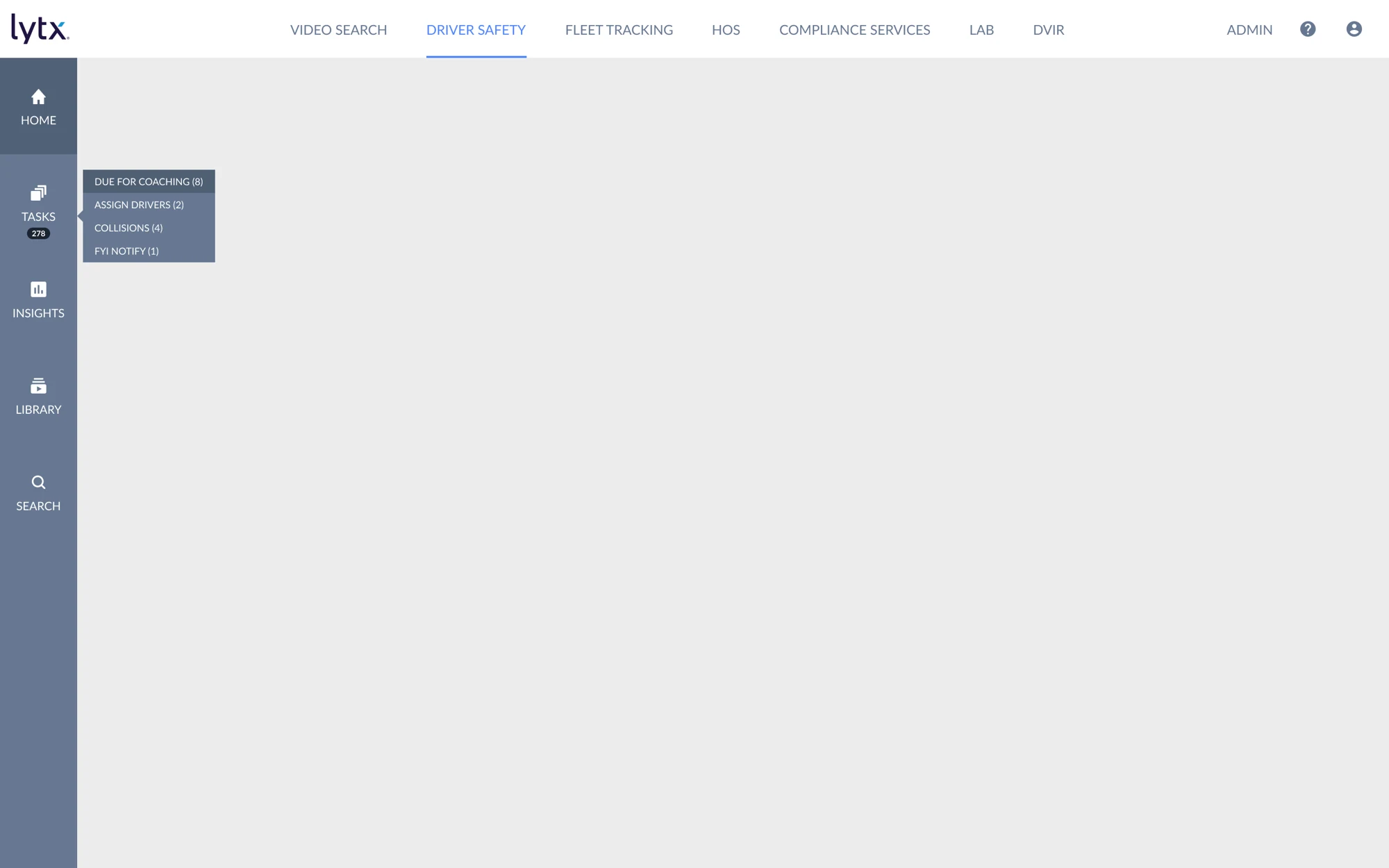
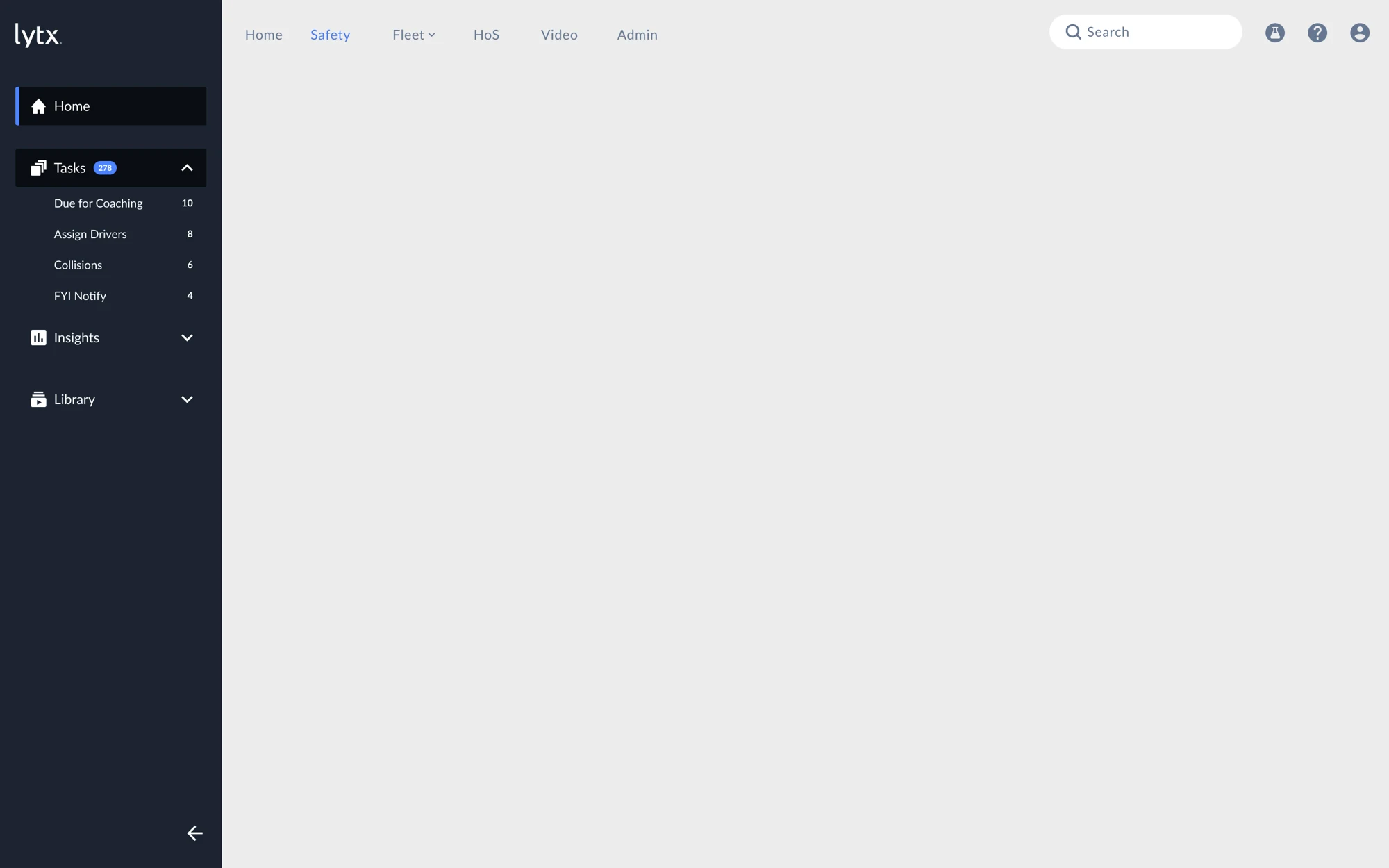
I focused on the relationship between product navigation and the tasks within each area. The proposed shell keeps product areas across the top and organizes Home, Tasks, Insights, and Library in a persistent side rail.
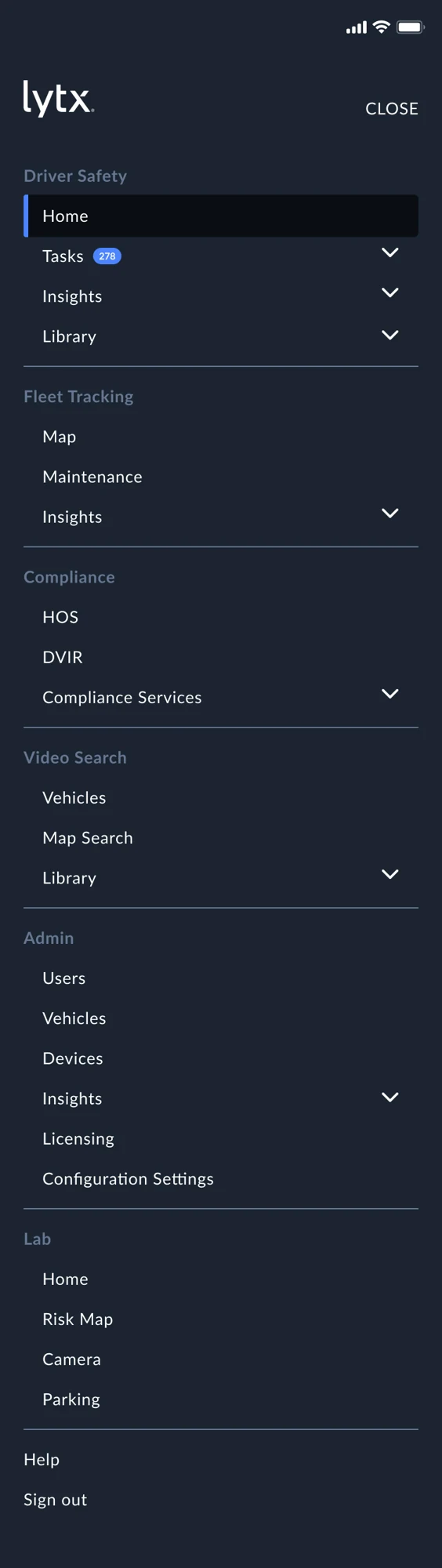
Expandable groups expose the next level of tasks, while a collapsible rail gives users more room for their work. The mobile exploration carries that grouping into a smaller screen. Together, these patterns establish how the broader interface is organized.
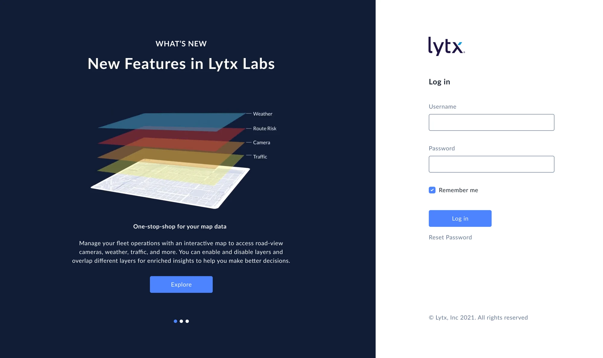
Mobile navigation and the login experience
02 / Product direction
Start with the work customers repeat.
Customer input highlighted two related needs: control over what appears on a dashboard, and less manual work to assemble useful reports.
The design direction responds with configurable views, a more consistent visual language, and a shared interface for an increasingly broad product.
- Data driven
- Keep operational signals visible and accessible.
- Modern visuals
- Use a clearer hierarchy and consistent interface patterns.
- User customization
- Let customers organize information around their work.
- All-in-one direction
- Connect product areas through a common shell.
03 / Personalization
Let the dashboard fit the job.
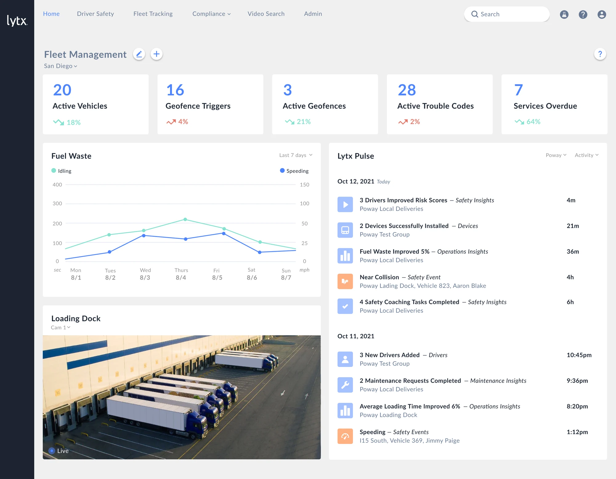
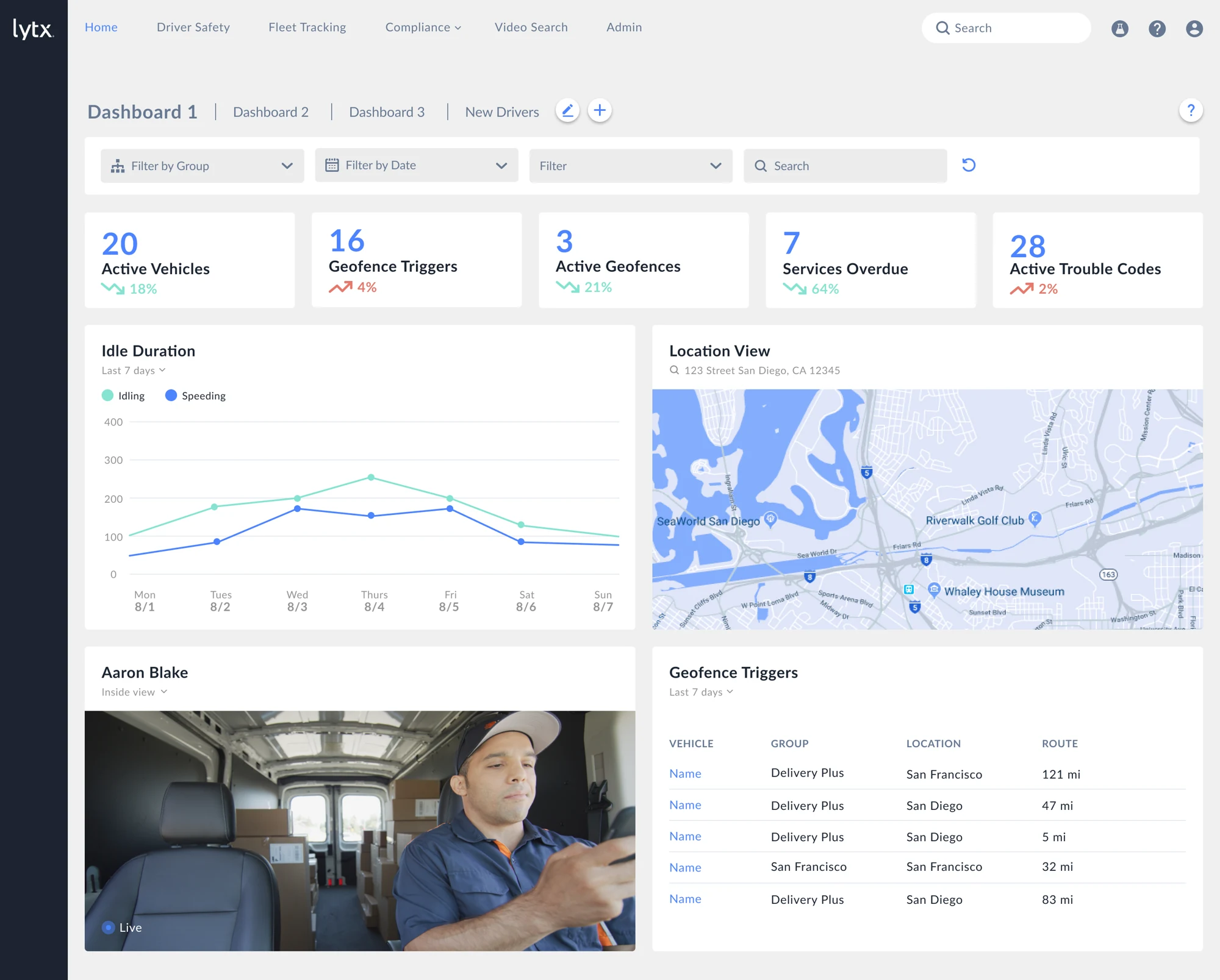
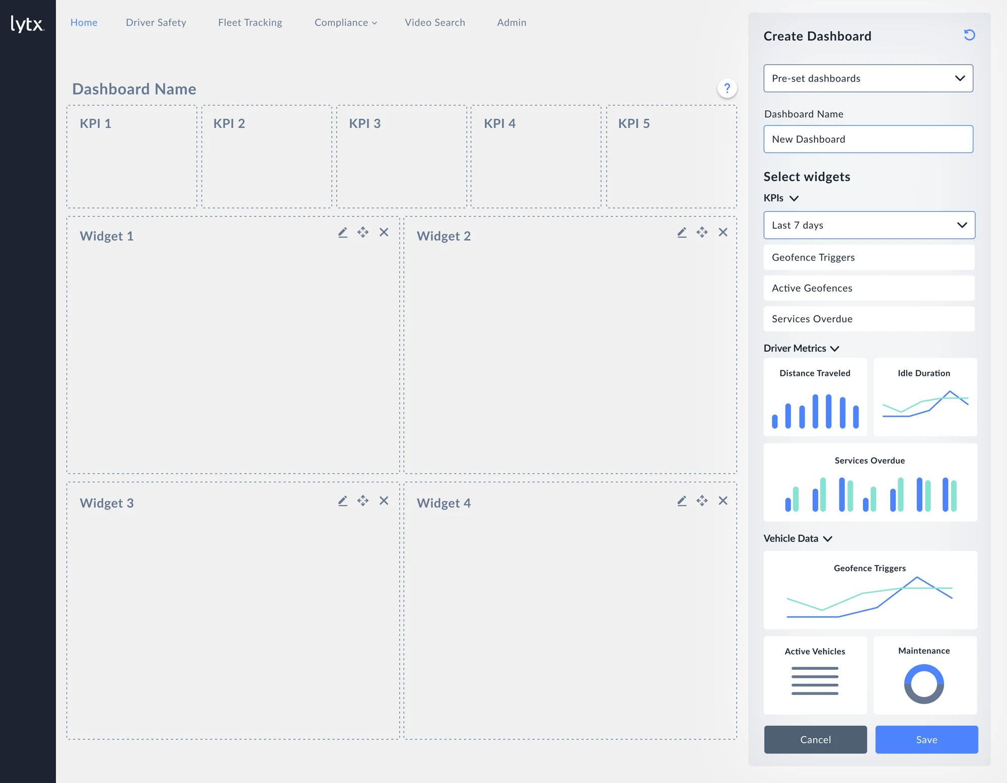
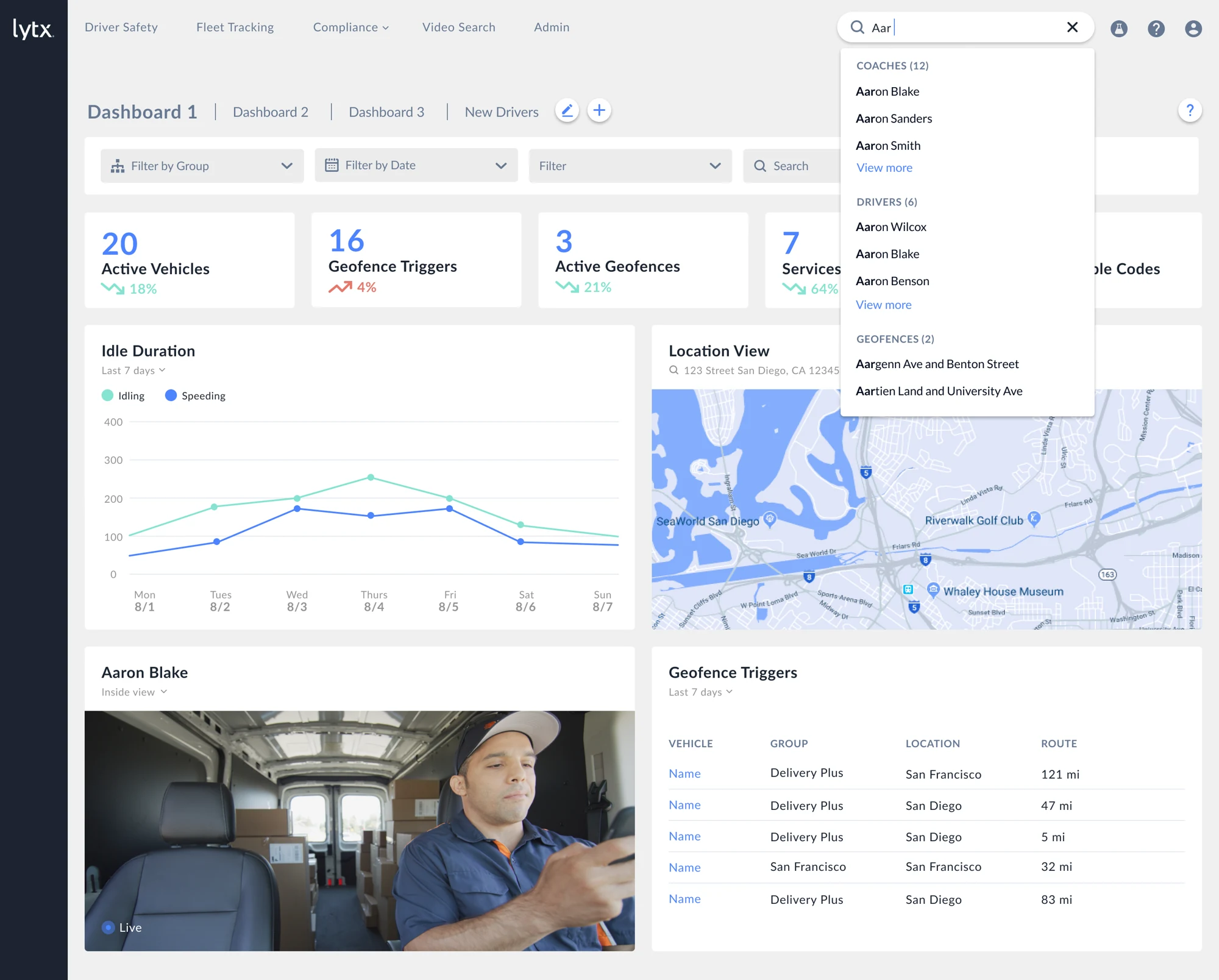
The dashboard pairs operational KPIs with maps, charts, video, and tables. An edit mode makes the composition explicit: select widgets, arrange the workspace, and save the view.
This turns the request for customization into a visible interaction model, with the controls placed beside the layout being edited.
04 / Reporting & search
Give users control over dense information.
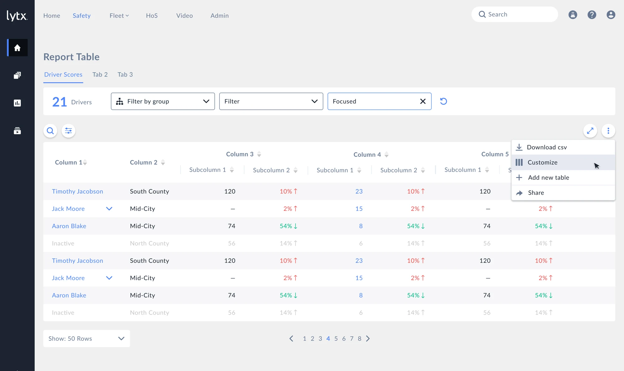
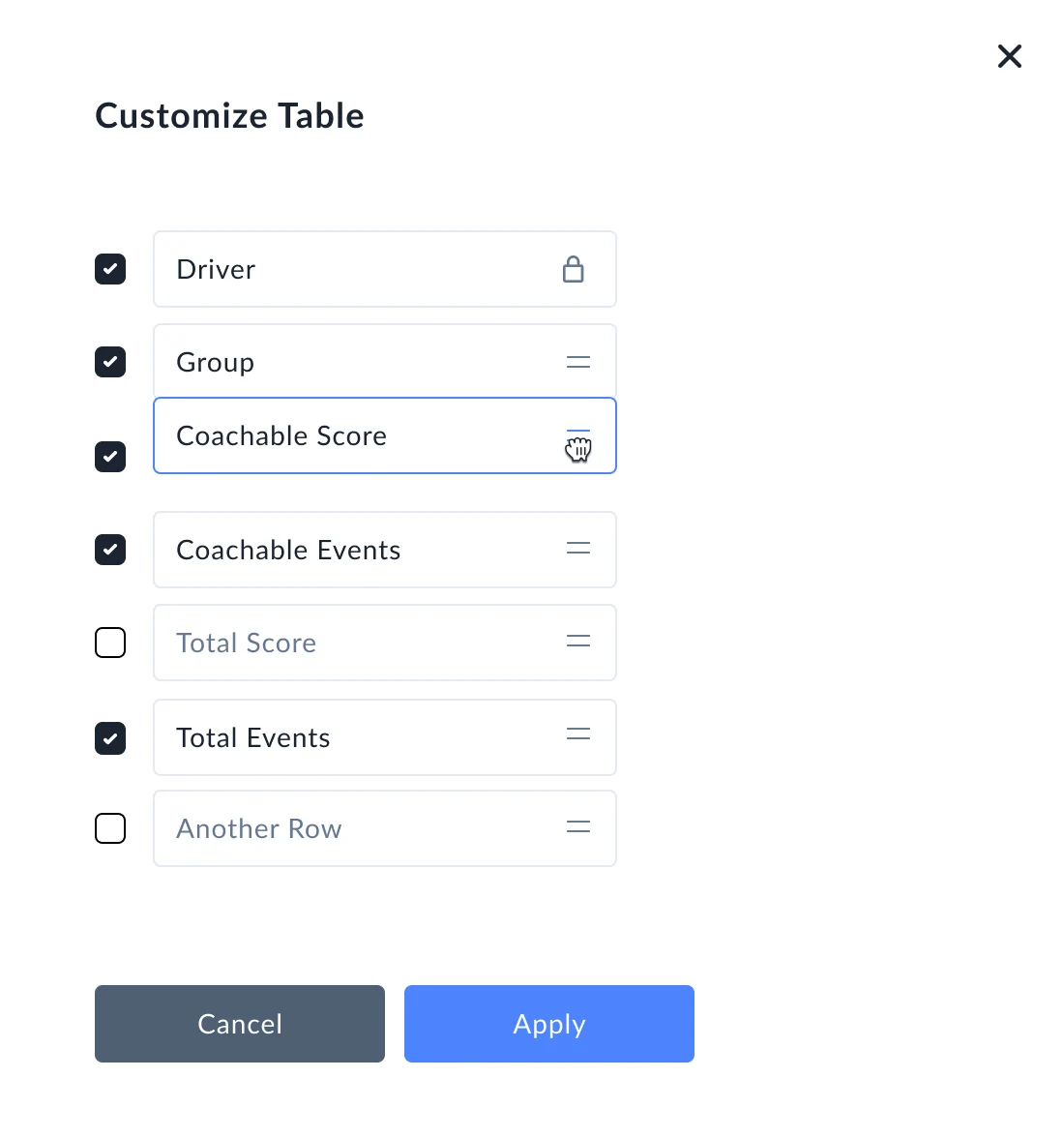
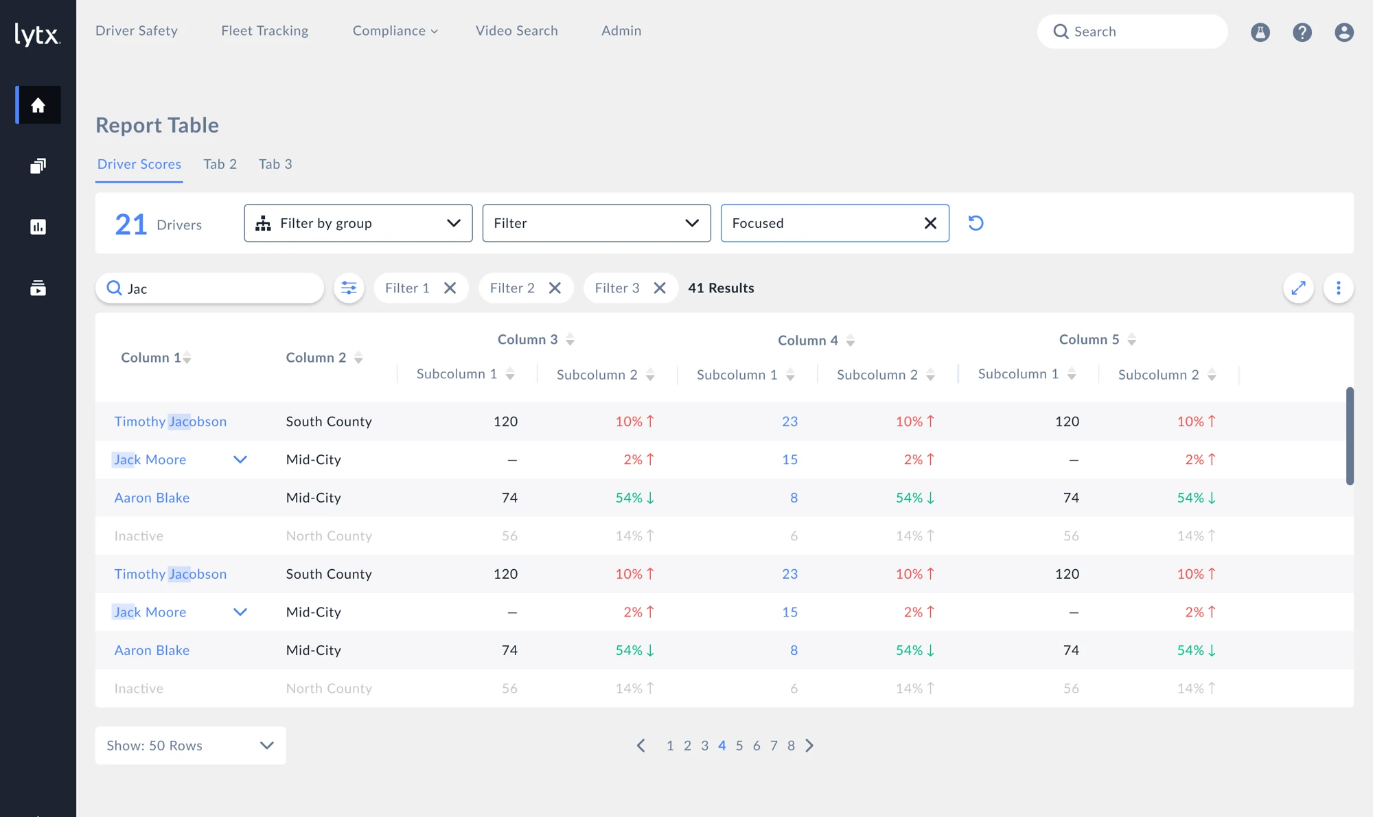
Report controls support reordering columns, showing or hiding fields, searching within results, and combining filters. The deck also explores full-screen tables and infinite scrolling for longer lists.
Universal search extends that pattern beyond a single report, with results grouped by entities such as coaches, drivers, and geofences.
Report filters and universal search
05 / Fleet workflows
Keep the event connected to its context.
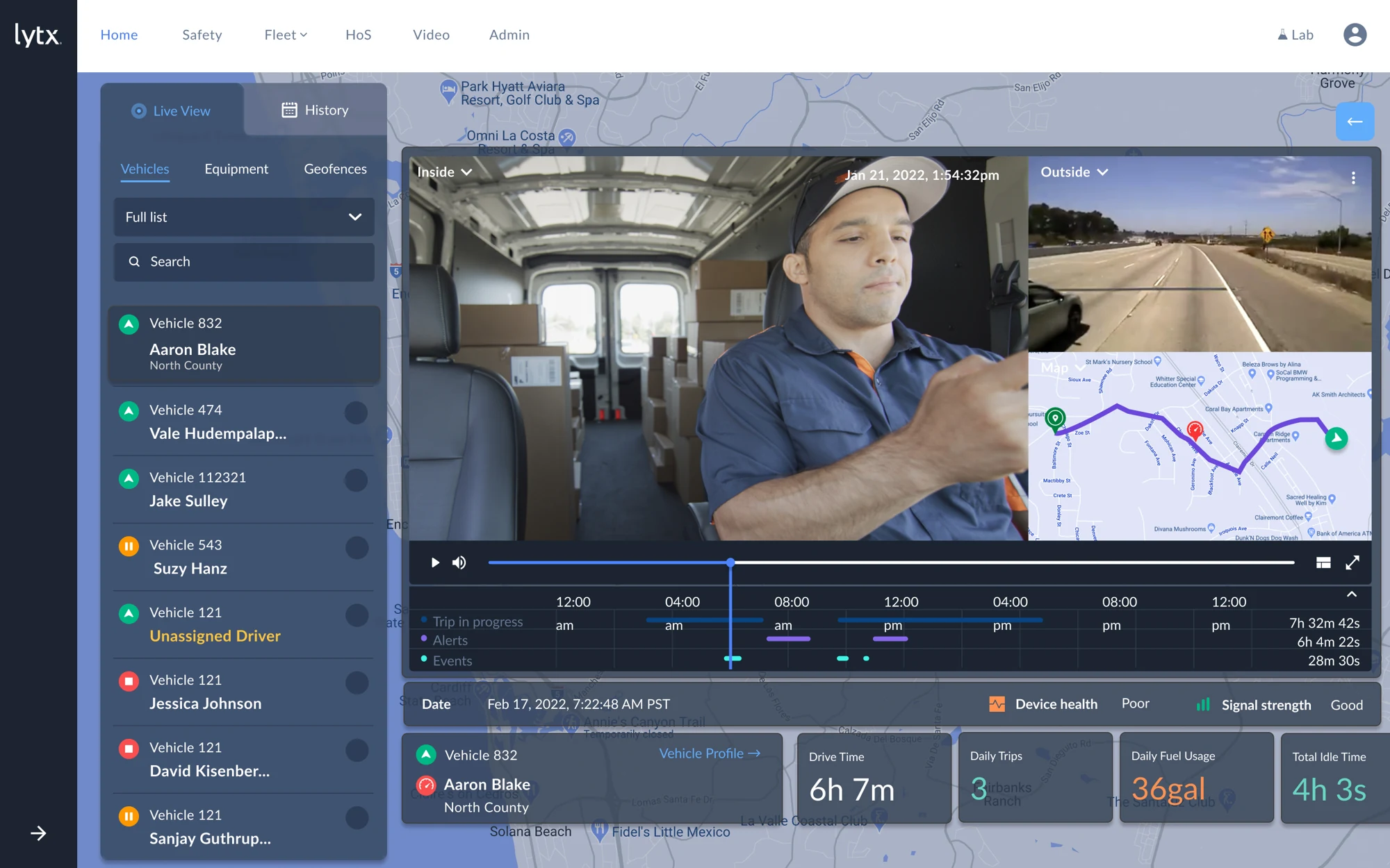
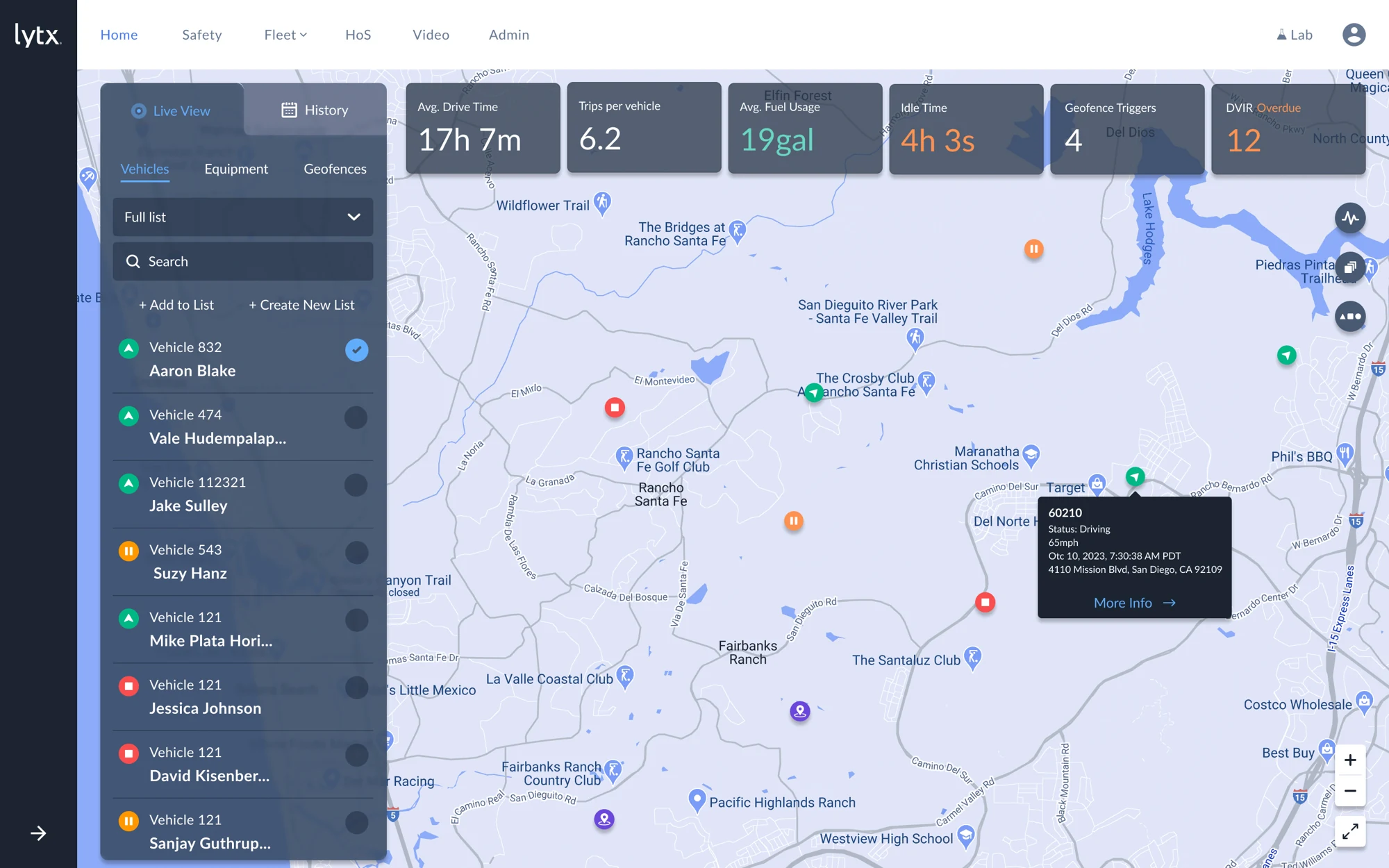
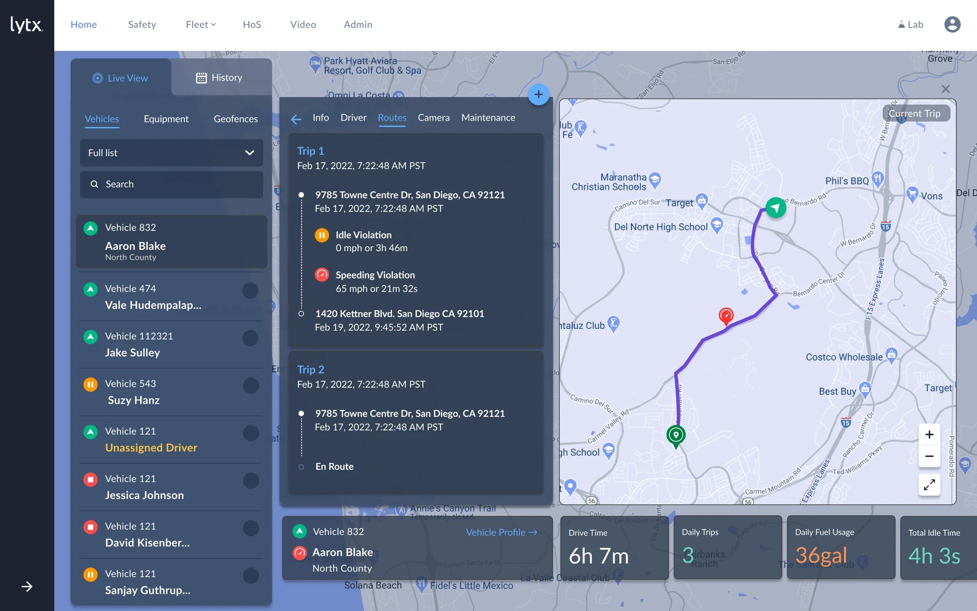
The fleet-map explorations bring vehicles, operational metrics, trip history, and video into the same workspace. Selecting a vehicle reveals more detail while retaining the surrounding map context.
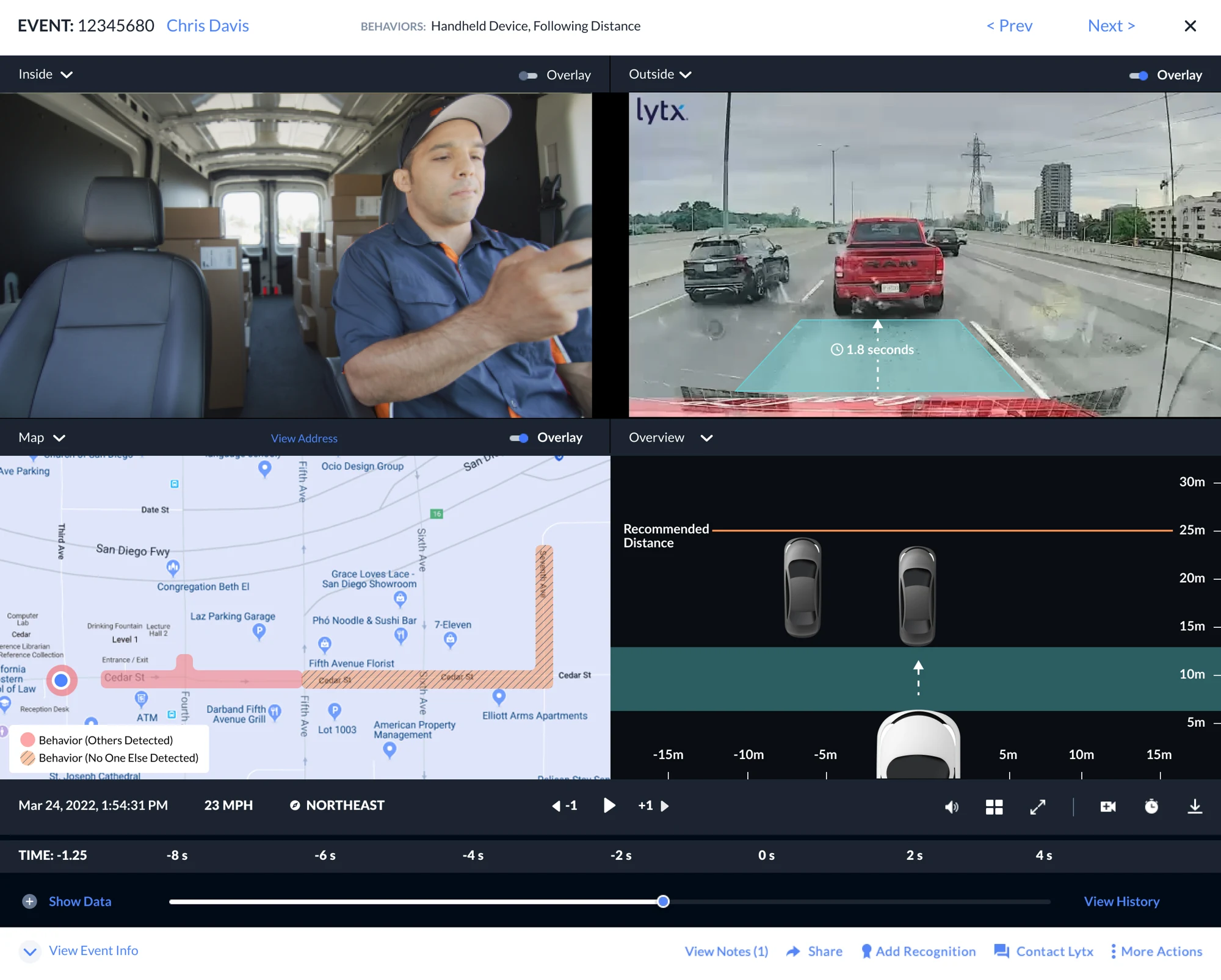
The video view combines inside and outside footage with a route map and timeline, so the event can be reviewed alongside the trip.
Fleet overview and trip history
06 / Further explorations
Extend the system into activity and evidence.
Lytx Pulse explores an activity feed alongside fleet metrics. The video-overlay concept adds following-distance context to event playback.
Together, these designs show how the interface direction extends from a shared shell into detailed operational workflows.